The Standard
Every rep counts. Every detail counts. The brand holds the same line the training does. No shortcuts, no softness, no exceptions.
Every rep counts. Every detail counts. The brand holds the same line the training does. No shortcuts, no softness, no exceptions.
Transformation is not comfortable, not pretty, and not fast. It is earned. Iron & Ember sells the work, not the wish.
What you walk out with is something most gyms cannot deliver. A sense of becoming. Proof you did not flinch.
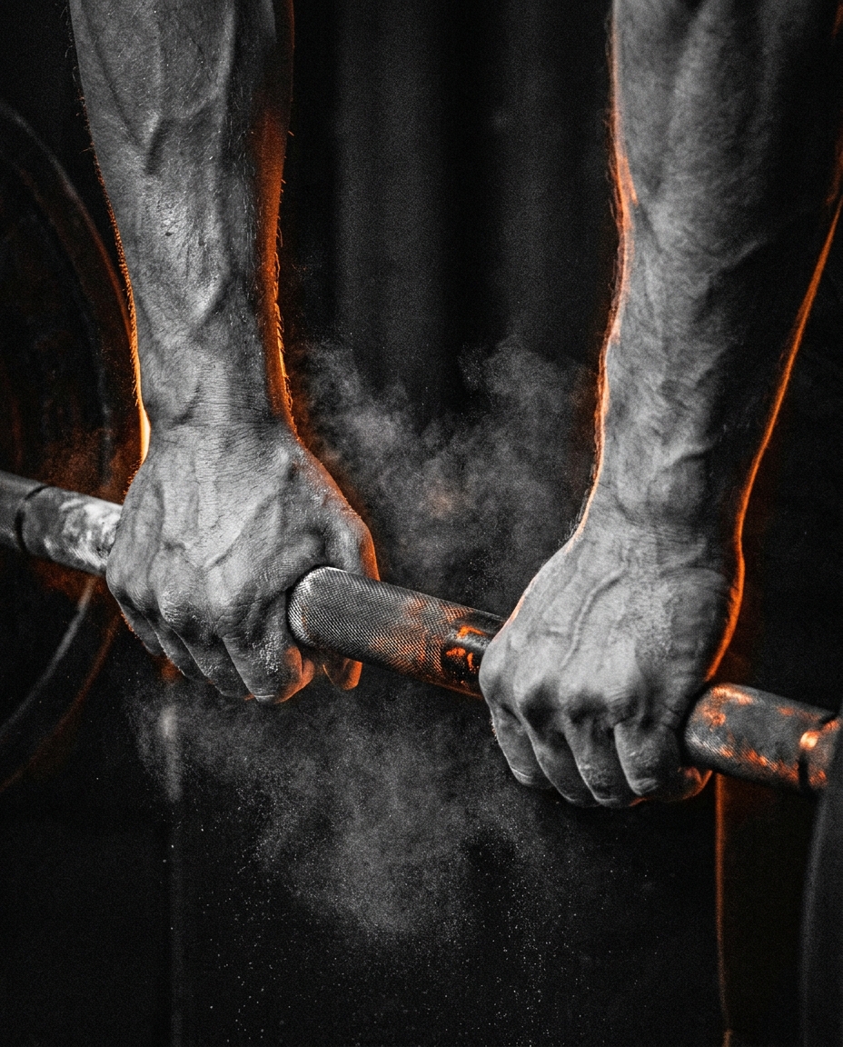
Iron & Ember didn't start in a boardroom. It started at 5 AM, in a garage that smelled like chalk and ambition, with nothing but a barbell and a decision.
This is a brand for the people who know transformation isn't comfortable, isn't pretty, and isn't fast, but it's always worth it. Iron & Ember lives at the intersection of raw effort and refined purpose, a fitness experience that pushes you to your limit and hands back something you earned.
Named for the place where raw material becomes something extraordinary. Six colors. Exact hex. No approximations. Every surface defaults to Carbon Black.
The fire. CTAs, headlines, the logo, the pulse. Any element that commands attention.
The discipline. Subheads, metallic accents. Cold precision against the heat.
The reward. Premium tiers and achievement moments only. Used sparingly to keep its impact.
The urgency. Alerts, drops, deadlines. Never placed directly against Electric Orange.
The foundation. Default background for every surface. Dark enough to let color pop, warm enough to never feel sterile.
The clarity. Body copy and primary text on dark. Sharp, legible, never pure white glare.
Never pastels, never airy. The brand lives in dark, high-contrast environments. No light backgrounds, no soft tones.
Never approximate. Every color in every application traces to the six-color system at exact hex. No "close enough."
Never Orange against Red. Electric Orange and Ember Red are never paired directly. Carbon Black always separates them.
Gold is for achievement only. Champion Gold marks wins and premium tiers. It is not a decorative accent.
A coach who respects your time. Direct copy, set in Archivo, carries the system from signage to schedule to screen.
"You don't rise to the level of your goals. You fall to the level of your training. We build the floor."
Spec ·Membership page"5 AM doesn't care how you feel. Neither do we. Show up. The rest follows."
Spec ·Social caption"No mirrors for vanity. Mirrors for form. There is a difference and we coach it."
Spec ·Interior signageThe tone is a coach who respects your time. It states the standard once and expects you to meet it. Earned, not given.
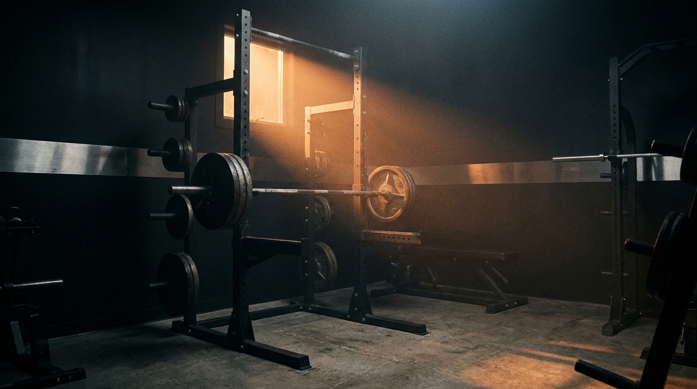
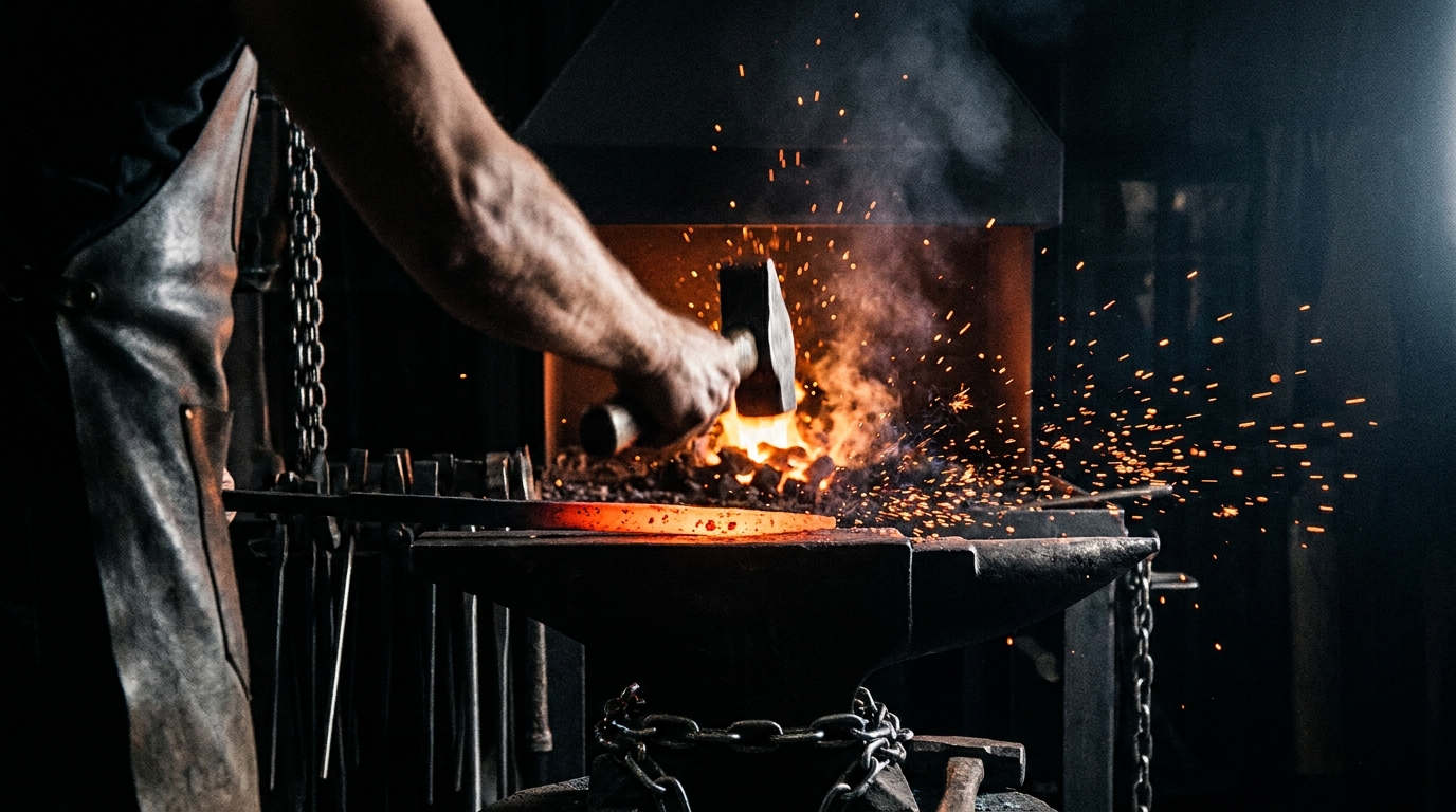
High contrast, dark environments, real effort. Never stock. Never staged. Never abs laughing at a salad.
 The Floor
 The HeatThe Grip
Most gyms sell access. Iron & Ember sells a standard you have to earn.
From storefront glass to social feed to gym merch. This is what a fully realized brand system looks like when it shows up everywhere at once.
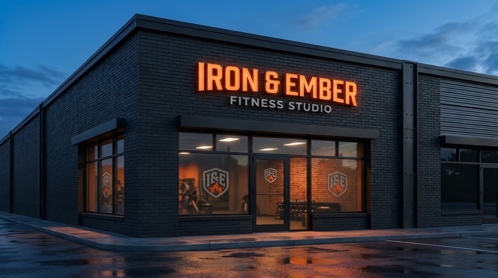
Get the brand on the building first. Backlit channel letters in Electric Orange on matte black fascia, shield icon at the entrance, frosted window graphics with the tagline and hours in Steel Silver. The space should feel like stepping into the brand board.
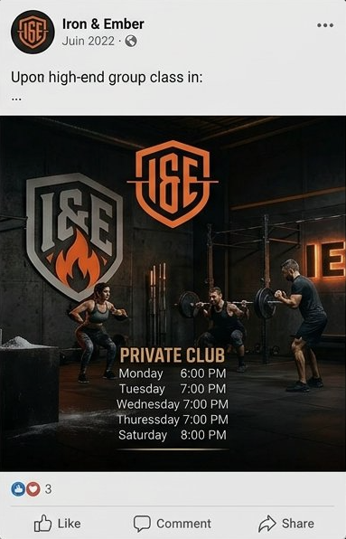
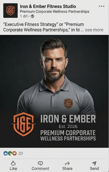
Three template directions running: announcement, motivation, schedule. Every post traces to the six-color system, set in Archivo Black. Real floor footage only, no stock. The feed matches the energy of the room.
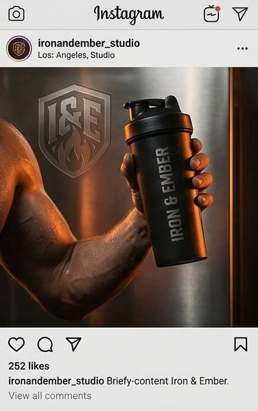
Carry the standard out the door. Performance tee with the left-chest shield, matte black shaker, embroidered towel, structured snapback. Carbon black with the orange mark, tagline on the hem. Members become the signage.